Visualizing Foursquare Check Ins
Last Updated on
Let’s not forget, Foursquare was created as a game. Get points for check ins to different places, and pit yourself against your friends and colleagues. But for many, the boredom factor has kicked in. Check in at the same place over and over, and the points dwindle. If (like me) you travel around a lot, mayorships are stuff of dreams.
So what’s left to play with if you’re stuck for points and over the mayorship honeymoon? At the end of the day, each Foursquare check-in leaves a data footprint. Strip it back to it’s basic function, and Foursquare is essentially a location memory system. It tracks how many times you check into a particular place, and your most popular categories. This leaves a nice potential for data visualisation.
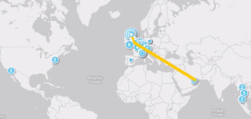
Step forward Weeplaces.com. WeePlaces makes use of your Foursquare data by creating geoprofiles, a personal page of your check in experiences. That way, they can store and organize your geodata to create an amazing Foursquare visualization. Here’s the visualisation I created back in May;
A Year of foursquare Check Ins from Simon H on Vimeo.
Give it a go yourself, and check our my Travel Map for more check ins.


Trackbacks & Pingbacks
[…] First video production – Visualising Foursquare Check Ins […]
Leave a Reply
Want to join the discussion?Feel free to contribute!